Adjacency matrix plots with R and ggplot2
While the circle-and-line idiom used by many network visualization tools such as Gephi can be useful for investigating the structure of small- and medium-scale networks, large-scale network visualizations tend to result in the worst kinds of spaghetti plots.
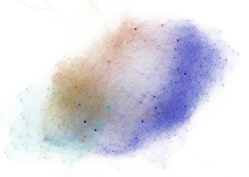
The abundance of crossing links creates a confusing visual pattern that masks the topological structure of the network. Moreover, it is extremely difficult to compare two different networks from these visualizations, which rely on a randomized layout algorithm.
One good alternative is to visualize an adjacency matrix encoding the network relationship data, where, for example, cell AB describes an edge connecting node A to node B. Mike Bostock has implemented this in D3, using Jacques Bertin’s Les Misérables co-occurrence network dataset. It is also fairly easy to generate an adjacency matrix visualization using ggplot2, but it does require that you bite the bullet and finally figure out how to work with ordered factors.1
(What? No, I’m not projecting at all, why would you say that?)
Calculate network properties
For this example, I will be working with an extract of a larger network database I have built of connections between print engravers and publishers in the Netherlands in the late sixteenth and early seventeenth century. This extract focuses on the artists in the ambit of Hendrick Goltzius, a virtuoso who ran his own print shop in Haarlem in the 1580s and 90s before turning to painting after 1600.
Like most network analysis, we start with an edge table for your network comprising rows with from and to variables, along with any number of edge attributes, such as weight.
You may also have an additional table of node attributes; in my case, I am using a table with the birth years for each artist.
I will use the igraph package to augment these tables with calculated network statistics.
library(igraph)
library(dplyr)
library(ggplot2)

# Read in CSV files with edge and node attributes
original_edgelist <- read.csv("goltzius_graph.csv", stringsAsFactors = FALSE)
original_nodelist <- read.csv("goltzius_nodes.csv", stringsAsFactors = FALSE)

# Create iGraph object
graph <- graph.data.frame(original_edgelist, directed = TRUE, vertices = original_nodelist)

# Calculate various network properties, adding them as attributes
# to each node/vertex
V(graph)$comm <- membership(optimal.community(graph))
V(graph)$degree <- degree(graph)
V(graph)$closeness <- centralization.closeness(graph)$res
V(graph)$betweenness <- centralization.betweenness(graph)$res
V(graph)$eigen <- centralization.evcent(graph)$vector
After running these calculations, we now want to emit dataframes of nodes and edges with these additional attributes.
Because I would like to color the “edges” (i.e. matrix cells) of my plot based on community, I need to join the comm attributes of both the from and to nodes to my edge list, and then generate an “edge community” variable based on the matchup between comm.x and comm.y.
# Re-generate dataframes for both nodes and edges, now containing
# calculated network attributes
node_list <- get.data.frame(graph, what = "vertices")

# Determine a community for each edge. If two nodes belong to the
# same community, label the edge with that community. If not,
# the edge community value is 'NA'
edge_list <- get.data.frame(graph, what = "edges") %>%
  inner_join(node_list %>% select(name, comm), by = c("from" = "name")) %>%
  inner_join(node_list %>% select(name, comm), by = c("to" = "name")) %>%
  mutate(group = ifelse(comm.x == comm.y, comm.x, NA) %>% factor())
Create a matrix plot
To make sure that both plot axes display every network node, we need to tweak our from and to vectors, which are currently just two bunches of strings, to a pair of factor vectors.
In R, factors are a special kind of vector that contains not only values, but a list of levels, or potential values, for a given vector.
Before plotting, we will turn from and to into factors with the factor() method, setting their levels to the full list of nodes in the network.
# Create a character vector containing every node name
all_nodes <- sort(node_list$name)

# Adjust the 'to' and 'from' factor levels so they are equal
# to this complete list of node names
plot_data <- edge_list %>% mutate(
        to = factor(to, levels = all_nodes),
        from = factor(from, levels = all_nodes))

# Create the adjacency matrix plot
ggplot(plot_data, aes(x = from, y = to, fill = group)) +
      geom_raster() +
      theme_bw() +
      # Because we need the x and y axis to display every node,
      # not just the nodes that have connections to each other,
      # make sure that ggplot does not drop unused factor levels
      scale_x_discrete(drop = FALSE) +
      scale_y_discrete(drop = FALSE) +
      theme(
        # Rotate the x-axis lables so they are legible
        axis.text.x = element_text(angle = 270, hjust = 0),
        # Force the plot into a square aspect ratio
        aspect.ratio = 1,
        # Hide the legend (optional)
        legend.position = "none")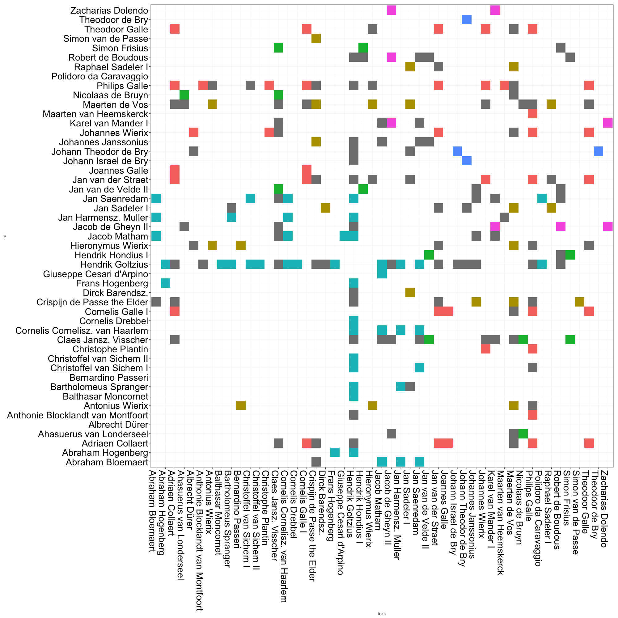
By default, ggplot will order the axes alphabetically by the names of each of your nodes. I’d wager that most network topologies are not correlated to the names of their constituent nodes.2 To get a more meaningful visualization, we need to reorder our axes.
Reorder the plot axes
ggplot orders its axes based on factor levels of the vector it is mapped to.
Therefore, to reorder our axes, we need to reorder our from and to factors based on the different node attributes that we calculated using igraph.
Let’s try ordering the nodes based on their community membership:
# Create a character vector of node names sorted by their
# community membership. Here, I rearrange the node_list
# table by the "comm" variable, then extract the
# "name" vector
name_order <- (node_list %>% arrange(comm))$name

# Reorder edge_list "from" and "to" factor levels based on
# this new name_order
plot_data <- edge_list %>% mutate(
        to = factor(to, levels = name_order),
        from = factor(from, levels = name_order)))

# Now run the ggplot code again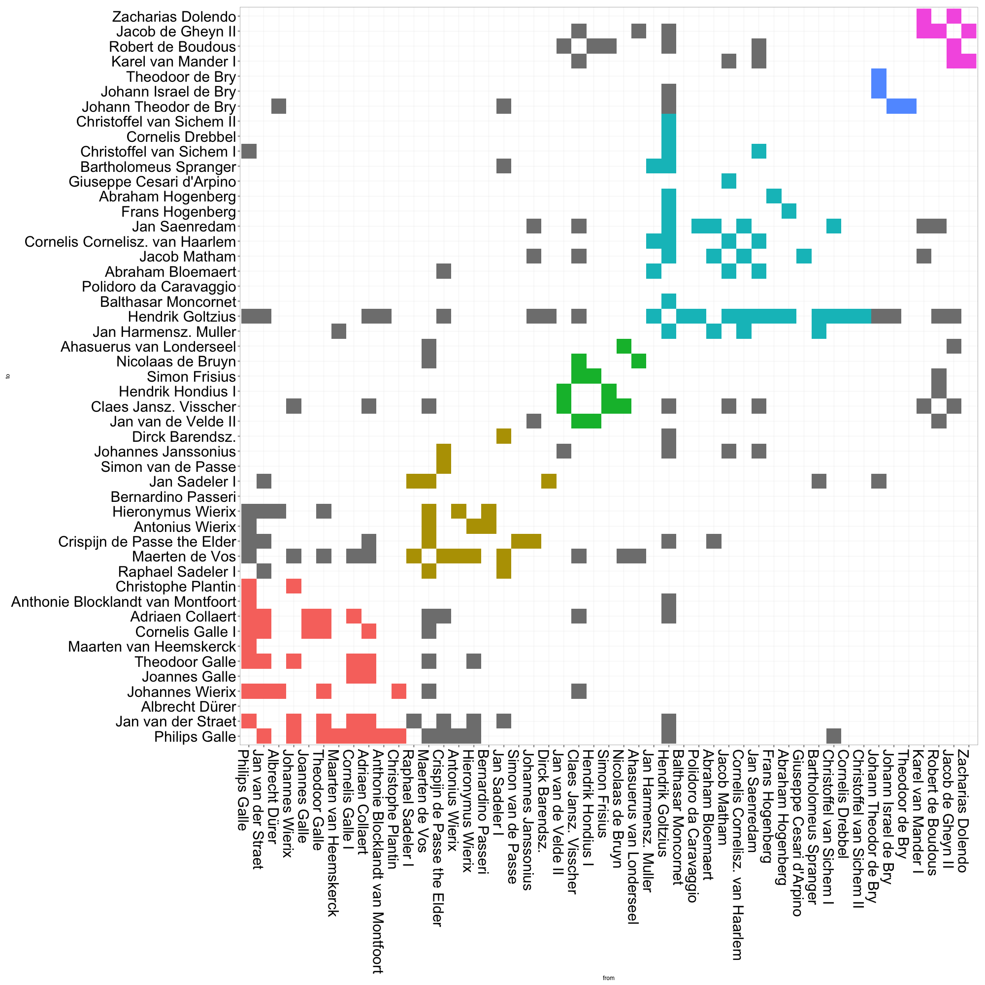
This matrix visualization clearly demonstrates the composition of communities, as well as their relative sizes. The large cyan grouping captures most of the artists in Goltzius’ immediate circle. It gets even more interesting when we take a closer look at the gray cells, i.e. the ties between actors that belong to different communities. There are a relatively high proportion of ties between the red and gold communities, which represent roughly two different generations of print producers based in Antwerp (although some other folks like Albrecht Dürer also slip in there). The green and purple communities also appear densely connected. These small groups comprise two generations of Amsterdam engravers and publishers, many of whom had worked in Goltzius’ firm in Haarlem, or who made later reprints after his designs. Already, it is much easier for us to quickly grasp patterns of connection across community borders.
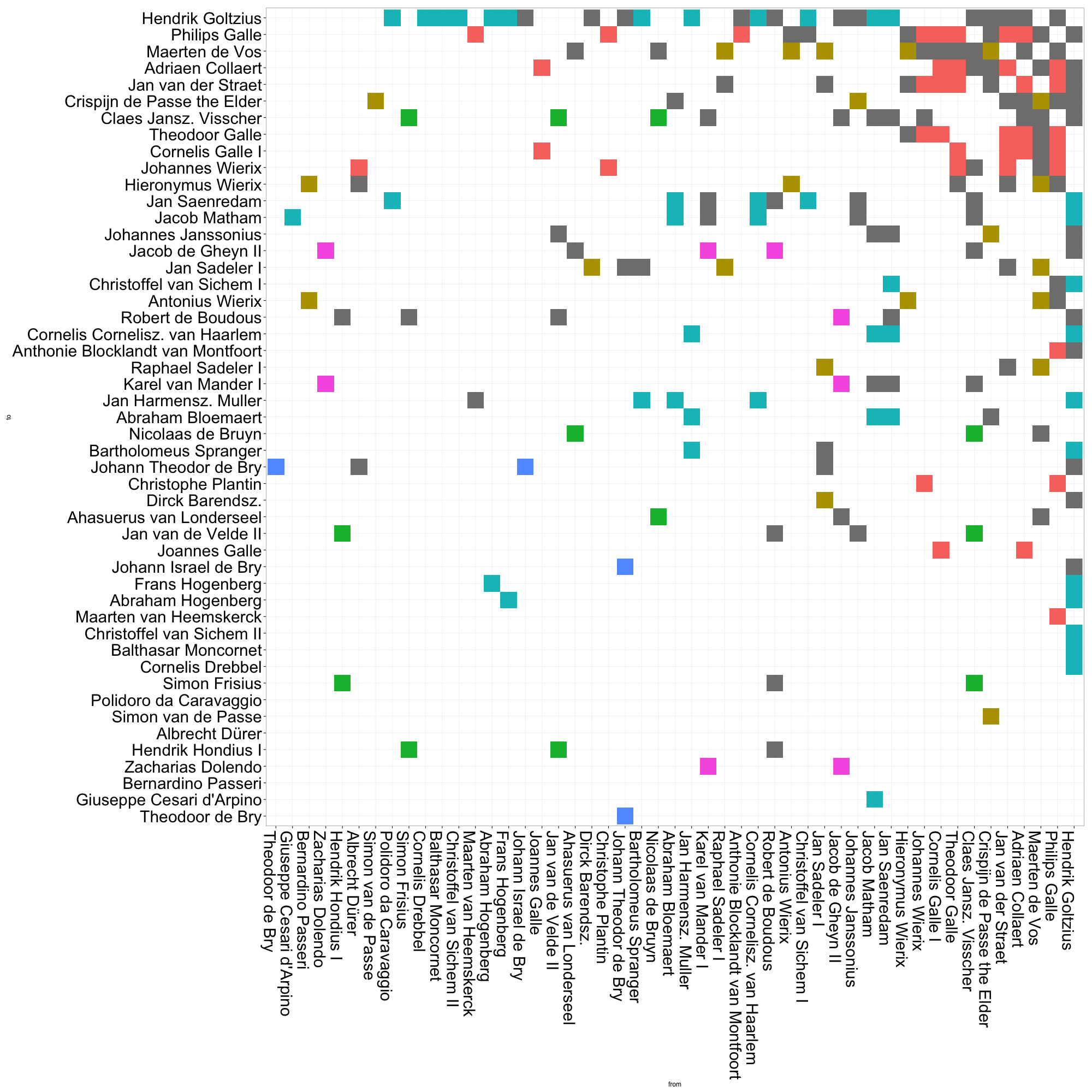
We can also arrange the plot by various measures of centrality. In this plot of eigenvector centrality, Goltzius naturally takes the top spot. But it is also clear that the red group — by in large, the group of mid-to-late sixteenth century Antwerp engravers and publishers — has a generally high EV centrality. This is quite unlike the other groups, whose members are scattered along the centrality scale. Though printmaking historians have generally argued that Amsterdam “inherited” Antwerp’s role of northern printmaking center in the seventeenth century, it may be argued that it did not fulfill quite the same structural role. That early generation of Antwerp print producers seems to have played a greater role in drawing together disparate communities of artists than did seventeenth-century Amsterdam. This kind of analysis prods us to reconsider what, exactly, we mean by “printmaking center”. Such a concept, as Benjamin Schmidt warns us vis-à-vis topic modelling, may shift over time.
