How did they make that? Extracting data from old plots
One quote from today’s DHNow Editor’s Choice, “Researcher Perspectives on Publication and Peer Review of Data”, really stuck out to me. In surveying how researchers obtained previously-published data, Kratz and Strasser note, “Eight respondents (5%) wrote-in that they had obtained data through a channel we had not considered: extracting data from the text, tables, or figures of a published paper.”1
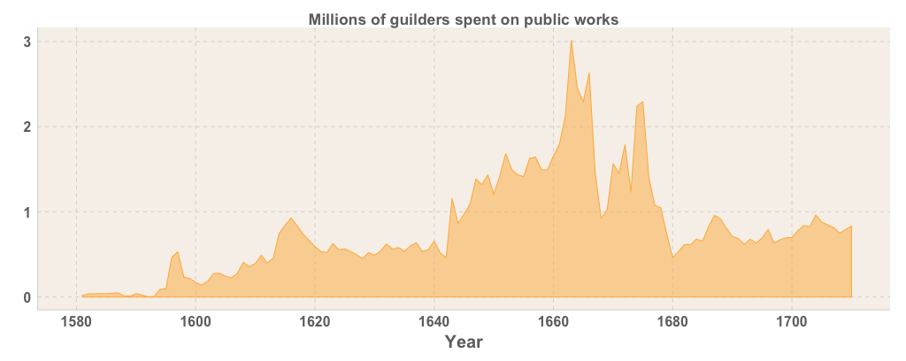
I found it necessary to do this a few weeks ago when preparing my talk for CAA on artistic attention in Amsterdam 1550–1750 as measured by prints from the Rijksmuseum. Inspired by Miriam Posner’s “How did they make that?”, I wanted to write up the back story behind the last slide of my presentation, which I derived from historical construction expenditure data that had previously been published by Marjolein t’Hart in a printed book.2 But I wanted more than a picture of the book — I wanted to compare its underlying data with my own. WebPlotDigitizer to the rescue! This is a great browser-based application developed by Ankit Rohatgi, which is available either on a hosted website, or which you can download yourself and run in your own browser.
1. Load your image
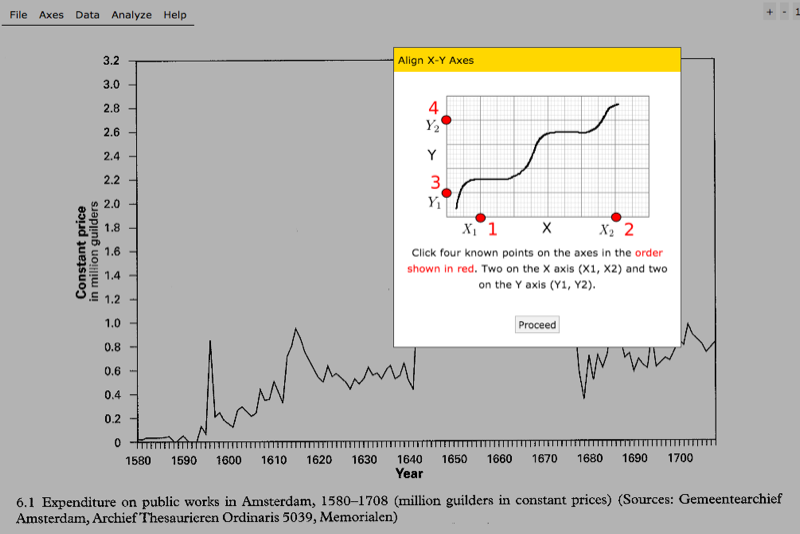
You’ll first need to scan your image — obviously the sharper the better, and try to avoid distortions from book gutters if you can. When you open WebPlotDigitizer, you can then load your scan. You’ll be prompted to calibrate your axes by clicking on two known points on each axis, and entering the values for each.
2. Click all the points!
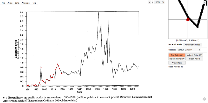
Start clicking away! Usefully, there’s a zoom window in the upper right corner that helps you more accurately place your cursor.
3. View your data
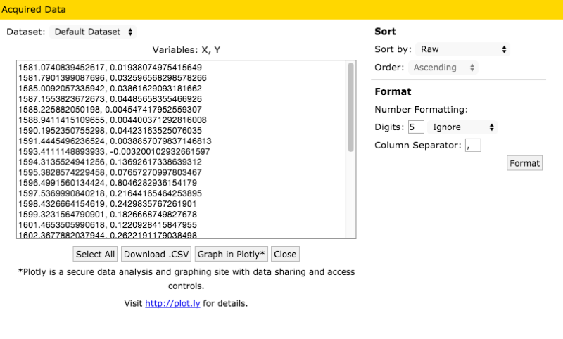
Once you’re satisfied with all your points, you can download the data as a CSV, or send it off to plot.ly.
4. Interpolate (advanced)
One drawback to manually digitizing your work is that points that are meant to have integer values (e.g. a year like 1604) often come out as real values (e.g. 1604.00325).
You can just round these integers, but depending how carefully you clicked, you may have multiple associated values with each of your rounded points.
Interpolation in the programming language of your choice is a useful solution.
This is a simple task with R’s approx() function:
# Get the column of your already-digital data you wish to match
desired_integers <- my_data$year

# Run the interpolation
interp_points <- approx(
    x = extracted_data$x,
    y = extracted_data$y,
    xout = desired_integers)

# Access the interpolated data
interp_points$x # => Interpolated x values (equal to desired_integers)
interp_points$y # => Interpolated y values
Voila — you can now incorporate extracted data from an old printed source into your digital workflow!
-
John Ernest Kratz and Carly Strasser, “Researcher Perspectives on Publication and Peer Review of Data,” PLoS ONE 10, no. 2 (February 23, 2015): e0117619, doi:10.1371/journal.pone.0117619. ↩
-
Marjolein ’t Hart, “The Glorious City: Monumentalism and Public Space in Seventeenth-Century Amsterdam,” in Urban Achievement in Early Modern Europe: Golden Ages in Antwerp, Amsterdam, and London, ed. Patrick Karl O’Brien (Cambridge: Cambridge University Press, 2001), fig. 6.1. ↩
