Matthew Lincoln, PhD Cultural Heritage Data & Info Architecture
Collaboratory Data Mining and Visualization Workshop
Setup
In this workshop we will be using plot.ly, an online platform for sharing datasets and collaborative visualization.
You will need to register an account with plot.ly for this workshop. Go to the plot.ly homepage and click on “Sign up” in the upper right corner of the page. If you already have a Gmail, Facebook, Twitter, or Github account, you will have the option to register using that account instead, so that you don’t have to create and remember a new password just for plot.ly.
Concepts
The data analysis pipeline
Today we are only doing one small step in data analysis.
- Acquire
- Store
- Clean
- Mutate
- Visualize <- we are here
- Narrate
Depending on the source of the data you want to work with, these steps may be easy or quite difficult. Each of these steps, particularly the cleaning step (in which we coerce “messy” values from the original dataset into regular, computable ones) and the mutating step (in which we generate entirely new variables by programmatically manipulating existing and/or cleaned variables), already involve a great deal of interpretation. We’re skipping ahead to what may be the most “fun” step — that of visualization — but bear in mind that this is only part of the process. This is not an entirely linear pipeline, either. You will always iterate your analyses, going back to change your data cleaning and mutation methods based on visualization results, and trying entirely new analyses as you determine the most effective way to compose your narratives.
Variables, observations, values
It helps to be specific about the different elements of a data table.
- Variables: These are the columns of the table, all the distinct kinds of information we have for each of our observations.
- Observations: These are the rows of the table, one for each discrete object or unit of our study
- Values: These are the cells of the table, one value for every variable for every observation.
Data Types
Understanding your two main data types will help you determine the most productive visualizations to try.
- Categorical: Data with a limited number of possible values that allow observations to be grouped.
- Ordinal: Data comprising numerical scores along an ordered scale, i.e. where one value can be said to be higher or lower than another.
Different types of plots are good for looking at ordinal or categorical distribution (histogram), categorical vs. ordinal (bar chart), or ordinal vs. ordinal (scatterplot).
Exercise 1: Dutch Collections at the NGA
Data link: https://plot.ly/~mdlincoln/9
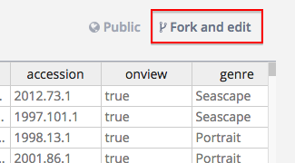
Follow the data link above, and sign in to plot.ly if asked to do so. You should see a preview of the data table. Click on the link that says “Fork and edit”.
This will copy the data to your account, and open the editing and plotting interface.
Data Provenance
Where did these data come from?
I scraped these data from the National Gallery of Art’s Online Edition of the 17th Century Dutch Paintings.
Some of the variables in the table are original to the NGA’s website, while some of them I generated during the process of data cleaning and mutation.
For example, the NGA lists dimensions as a string (a list of characters) rather than as numeric values.
Using a script, I extracted the numeric values from these strings to create the height and width columns.
I had to perform similar functions for creation and acquisition dates.
Also, I created categories such as set (the collector/curator who added the items to the collection) and genre manually or semi-manually.
- Original items
artistnationalitytitlemediumcreditaccessiononviewcreation_dateroom
- Generated items
genreheightwidthcreation_dateacc_dateset
Plot exercises
Try to devise plots that could shed light on these questions:
- How did the chronology of Dutch art represented in the Dutch galleries change over the course of the twentieth century?
- How did the balance of genres in the Dutch galleries change over the course of the twentieth century?
- What are the most efficient visualizations for representing the predilections of different collectors and curators for genre? For date? What about scale and orientation? (Don’t forget to try the often-ignored boxplot!)
Exercise 2: British Art Sales from the GPI
Data link:https://plot.ly/~mdlincoln/8
Data Provenance
These data comprise a random sample of about 0.4% (1500 out of 374277) of the British sales records maintained by the Getty Provenance Index. Because plot.ly runs in your browser, it cannot handle very large datasets, so we will be working will a small sample of the database. For larger sets of data, you will want to use a more powerful set of programs, such as R and RStudio.
Many of the original variables in this table are not easily computable in their original form.
Scroll to the rightmost columns (starting with the Date column) to see the cleaned/mutated variables that are most easily plotted:
Date(of sale). The following variables are derived from this one:YearMonthWeekYDay(day of the year)MDay(day of the month)WDay(day of the week)
Transaction.TypeTransaction.AmtNationalityPeriod(This is a categorical variable derived by grouping observations based on the values of the ordinal variableYear)Price.Factor(Because inflation makes it difficult to compare theTransaction.Amtvalue for over time, I computed the categorical variablePrice.Factorto help group observations into five classes of value. Within eachPeriod, I determined the quintile distribution of every object sold, i.e. both the top 20% most expensive objects sold between 1790–1800 and the top 20% most expensive objects sold between 1830–1840 are in the 5th quintile.)
Plot exericses
Try to devise plots that could shed light on these questions:
- What was the most popular time of the year to sell artworks? What was the most lucrative?
- How do these patterns differ for cheap vs. expensive artworks?
- Did these patterns change between 1790 and 1840?
We will quickly run into the limits of the plot.ly interface with these qeustions! In lieu of coming up with effective plots, we should at least try to conceive of how we might operationalize, or make measurable, these questions. More advanced tools may be necessary to visualize the kinds of patterns we want to detect.
Advanced analysis
Using R, I have generated a web interface that implements some measurements of these questions. (I will provide the login information during the session)

https://matthewlincoln.net by Matthew Lincoln is licensed under a Creative Commons Attribution-NonCommercial 4.0 International License • Colophon • Revision history for this page