Six Degrees of Francis Bacon
I feel so energized and excited after reading posts on Six Degrees of Francis Bacon, which tracks a project to analyze the Oxford Dictionary of National Biography and generate a digital representation of the English early modern social network. They are just beginning to post early-stage, large-scale visualizations of their current database.
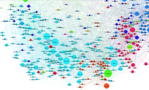
Their posts are a must-read for any humanities scholar who struggles with justifying spending time and resources on data-driven visualizations in an anecdote/narrative-centric discipline. SDFB makes a convincing case that network visualizations aren’t for communicating arguments we already understand, so much as for suggesting new avenues or paradigms of inquiry. Instead of looking at a network graph as an evident narrative,they argue, treat it like “a rather large map of problems”:
Why does Henrietta Maria have a community distinct from her husband and those most proximate to her? Why does Jacob Tonson sit so far out to the upper-right hand corner? Why are certain nodes so evidently out of place? When and why don’t communities align with proximity, color with clustering? The problems call out for further explanation, interpretation, and speculation especially by experts with knowledge of the period, of particular figures, or of graph learning and/or visualization.
(image credit: sixdegreesoffrancisbacon.com)
