Looking through the ULAN with Gephi, I
These past few weeks I have been sorting through the data available in the Getty’s Union List of Artist Names, learning how to parse its raw XML and create tables of relevant data.
I was initially interested in the ULAN for its geographic information, hoping to use it in visualizing on a large scale the evolving connections between Netherlandish artists and the broader European, and global, community in the sixteenth and seventeenth centuries. However, I was largely disappointed by the ULAN’s sparse geographic and chronological information. Most artists have only one, maybe two entries for their active locations; for example, poor Peter Paul Rubens, a continent-skipping artist, courtier, and diplomat/spy, is attached only to Antwerp.
The ULAN does, however, richly characterize artistic, professional, and familial relationships between its many entries. After meeting with Abram this week to learn more about his social network map of Benjamin West’s studio generated using Gephi, I was inspired to try the program out on a “small” sample of the ULAN database made available for download by the Getty.
There’s no denying that this nicely-styled network graph is pretty. But is it useful?
In the above graph, nodes are scaled by their degree (how many immediate connections they have to other nodes) and colored by their eigenvector centrality (a measure of their relative centrality to the network at large)1 Though the array of artists in the sample data is idiosyncratic (from Raphael to Hans Hoffman), it isn’t surprising to see big names like Jacques-Louis David appear, well, big due to their well-connectedness.
However looking at color in this graph is a bit more interesting. A node (like David) important to its immediate social neighborhood does not necessarily connect as many disparate groups as a node (like David’s close neighbor Jean-Baptiste Regnault) with greater eigenvector centrality.
What does this measure tell us about artists like Regnault? How should it inform the way we define and value relationships when thinking about art historical problems? The ULAN has a comprehensive vocabulary of association types, from professional associations like “teacher of” or “apprentice of”, to familial ones like “spouse of” or “child of”. On the scale of micro-art-history, we treat these relationships individually, valuing relationships sure to communicate stylistic influence over others. At this scale, our weighting can happen on a case-by-case basis; we can generate our narratives holistically.
But when trying to measure influence from a distant perspective, looking at dozens or hundreds of artists at the same time (something uniquely suited to a digital approach), we cannot make decisions case-by-case. We must instead define rules. These may be finely-tuned filters, but nonetheless they call on us to make generalizations. When I graphed the sample ULAN data, I established a filter that would only show artistic relationships, and would cut out familial ones.
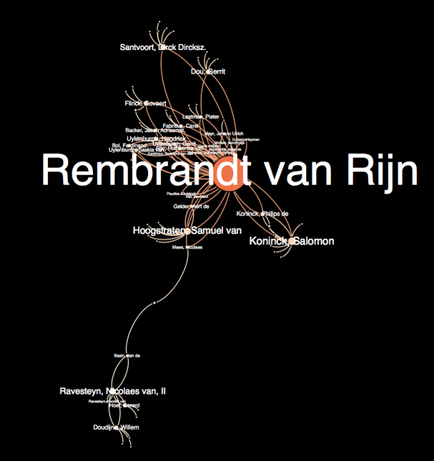
The corner of my graph showing Rembrandt reacted notably when I redrew the graph incorporating every type of relationship. Suddenly, Rembrandt was not only a central connector of individuals, but a connector of distinct communities that would otherwise not be attached.2
Much of this change is caused by the addition of several more nodes when I allowed Gephi to graph the full range of relationships described by the ULAN. However, note that non-artistic interconnections also appeared between nodes that had no other connections besides Rembrandt in the first iteration of my graph. In cleaning my data, I inadvertently undervalued nodes like Rembrandt that actually connected integrated communities, not just disparate individuals.
I initially thought to myself that this visualization and analysis would require a lot of preparatory planning to establish correct filtering and weighting rules. But distant looking might rather demand that the researcher iterate several visualizations, not to approach some platonic ideal visualization, but instead to generate layers to be superimposed and stitched together in a convincing narrative, much like Tim Sherratt suggested. In other words, I now wonder if this process of distant looking might have its own kind of holistic process distinct from, yet related to the close looking model.
The practice of distant looking at historical networks will need to establish its own critical methods as digital humanities fields mature (look to the folks behind Six Degrees of Francis Bacon for some deep posts on this topic.) Again and again, I think we will find that the processes of the digital humanities have much in common with the alternately-maligned-and-enshrined traditional methodologies.
-
For more on this measure, and on network mapping in general, see Robert A. and Mark Riddle, Introduction to Social Network Methods. (Riverside, CA, University of California, Riverside, 2005), ch. 10. (online version) ↩
-
Bear in mind I am speaking only of the attachments described by this small, un-representative sample set of the ULAN. The relationships of these communities would be much more fleshed out in the full version of the ULAN. ↩


