A life in an infographic
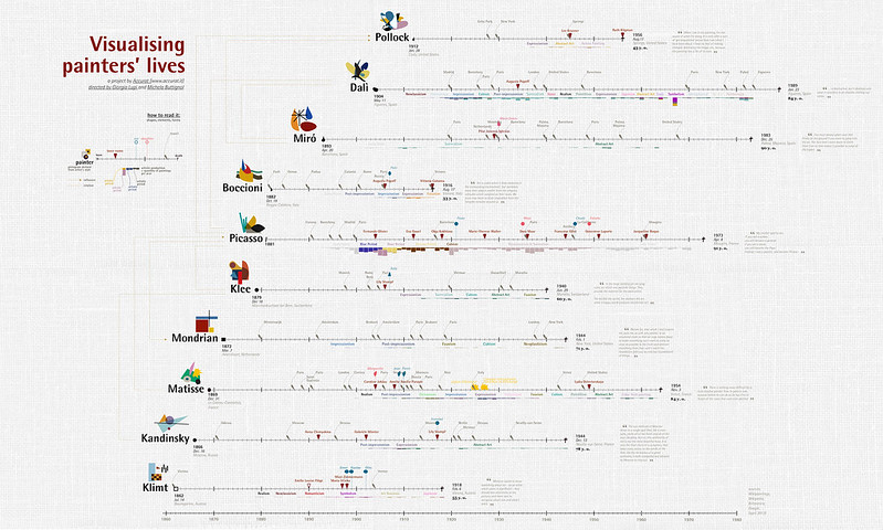
Something interesting that cropped up while I was on vacation last week. The design agency Accurat (which has developed several other novel visualizations of cultural texts and histories) has created intriguing infographics visualizing ten modern painters’ lives. (hat tip: hyperallergic via the MSCVC)
They have structured the infographics as multi-layered timelines marked with single-point events, spans of time indicating things such as a career in a studio or academy, or a romantic or professional relationship. Affixed to these representations of the artist’s life are timelines of their work signposted with landmark paintings, sigils rendered in the color schemes observed at that phase in the painter’s career, and histograms that claim to mark out that artist’s participation in a certain artistic school or movement. The iconography is delightfully idiosyncratic, shaped to resemble motifs that have come to be associated with each of the ten artists.
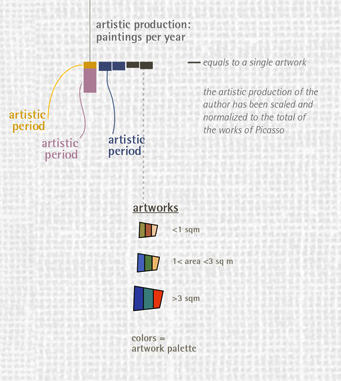
I’m particularly interested in the histograms charting artwork style, size, and palette. Accurat did a particularly admirable job visualizing the many schools and movements interweaved through each artist’s oeuvre: color-coded words are clustered and stacked near concentrations of paintings that exhibit a certain style, e.g. expressionism or cubism. But because bars on the histogram are keyed to these colors, it is also possible to clearly indicate one instance of late cubism in Matisse’s oeuvre, while still legibly showing that most of his experimentation with that style happened earlier in his life.
Some errant thoughts on the project:
-
While Accurat points out these graphs are by no means comprehensive or “scientific”, they mention that they drew data from open online databases like Wikipedia, so I wonder to what extent they automated this process.
-
Could one do something similar with data culled from ARTstor, which has very solid date and repository information, or artsy, which has tagged a wealth of works with more squishy metadata like color and movement?
-
A histogram of different styles works quite well for the exhaustively-taxonimized twentieth century, but I suspect this might not be quite as illuminating for earlier periods that haven’t been dissected into named stylistic movements. Maybe it would be productive to make a histogram of genres (portraits, landscapes, altarpieces) or sizes and compositional schemes.


