Live Peer Review: Mapping Architecture in Germany
Review format
What follows is the output of a literate code document with text interspersed with code that executes certain actions, sometimes resulting in underlying data transmission, and sometimes producing tables or figures instead. If you are interested in the mechanics of this review and analysis, you can peruse the embedded R code chunks. If not, stick to the regular text, where I explain what transformations I’m enacting on the authors’ data.
In the first half of this review, I will cover several, mostly minor data import issues (I’ve bolded direct critiques or suggestions for improvements), before addressing issues with the authors’ building type ontology. I will conclude with an extended thought experiment regarding what it can mean to think about spatial dispersion with this dataset.
# We begin be loading a number of useful packages
suppressPackageStartupMessages({
  library(readr)
  library(broom)
  library(dplyr)
  library(tidyr)
  library(ggplot2)
  library(lubridate)
  library(stringr)
  library(knitr)
  library(gganimate)
  library(purrr)
  library(mapproj)
  library(ggrepel)
  library(multiplot)
})
knitr::opts_chunk$set(echo = TRUE, fig.height = 5, fig.width = 7, dev = "svg", cache = TRUE)
Read in original data
Shared data is only useful if others can read your data.
Character encoding issues
Character encoding issues are horrid. When I initially opened this file in a text editor, the editor tried to guess the proper encoding to translate the bytes of the file into readable text. As you can see from this line, which it tried to interpret as UTF-8, it failed:
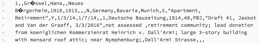
Special characters are clearly malformed here.
By experimenting with several different character encoding options, I was able to determine that this file was saved using the Mac Roman character encoding (incidentally, this is the default used by Excel for Mac.)
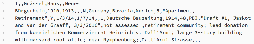
Ahh, much better
In order to convert this entire file to the more universally-accepted UTF-8, we can use the command-line utility iconv:
iconv -f macroman -t utf8 Historical_Journals_Mapping_German_Arch_1914-1924_Master.csv > utf_ga.csv
This will ensure that special characters like ö or ß get parsed correctly by R… as well as by most any other software that we’d like to use in the future.
The authors should ensure that the text files they save for distribution are encoded using UTF-8, to ensure that special characters are preserved.
Having converted the file into a more universally-friendly encoding, we can now begin to start using it within R.
Variable types
ga <- read_csv("utf_ga.csv")
## Warning: 160 parsing failures.
## row   col   expected  actual
##   5 Ref_2 valid date 4/15/14
##   6 Ref_2 valid date 4/15/14
##   9 Ref_2 valid date 1/21/14
##  12 Ref_2 valid date 1/24/14
##  16 Ref_2 valid date 1/31/14
## ... ..... .......... .......
## .See problems(...) for more details.
Already there are some parsing errors.
Columns Ref_1 and Ref_2 are intended to be dates, however they are entered in a slightly ambiguous manner, sometimes as M/DD/YY, sometimes as MM/DD/YY.
In future versions of these data, the authors should conform to the ISO 8601 standard for encoding dates (YYYY-MM-DD), which will reduce this ambiguity.
We will force read_csv to treat those columns as character/string columns, and then parse them using the more flexible functions from the lubridate package.
ga <- read_csv("utf_ga.csv",
               col_types = cols(Ref_1 = col_character(),
                                Ref_2 = col_character()))

date_fix <- function(d) {
  # Add "19" prefix to each year
  fd <- str_replace(d, "(\\d{1,2}/\\d{1,2})/(\\d{2})$", "\\1/19\\2")
  # Parse the dates as "month - day - year" into an R date object
  mdy(fd)
}

# We can test this function on January 23rd, 1917:
date_fix("1/23/17")
## [1] "1917-01-23"
# That worked for our sample date; let's apply it to both date columns
ga <- mutate(ga, Ref_1n = date_fix(Ref_1), Ref_2n = date_fix(Ref_2))
## Warning: 4 failed to parse.

## Warning: 1 failed to parse.
There are a few malformed dates here. Let’s inspect them:
ga %>%
  select(Bldg_ID, Ref_1, Ref_1n, Ref_2, Ref_2n) %>%
  # Which dates are filled in the original data, but failed to parse?
  filter((!is.na(Ref_1) & is.na(Ref_1n)) | (!is.na(Ref_2) & is.na(Ref_2n))) %>%
  kable()
| Bldg_ID | Ref_1 | Ref_1n | Ref_2 | Ref_2n |
|---|---|---|---|---|
| 644 | 2/29/1917 | NA | NA | NA |
| 645 | 2/29/1917 | NA | NA | NA |
| 646 | 2/29/1917 | NA | NA | NA |
| 647 | 2/29/1917 | NA | NA | NA |
| 1529 | 3/8/24 | 1924-03-08 | 10/15/1924; 12/24/1924 | NA |
Buildings 644-647 have invalid reference dates: 1917 did not have a February 29th, so we will adjust that day to February 28th.
Building 1529 apparently has multiple “second reference” dates separated by a semicolon.
Semicolon-delimited dates are not documented in the author’s data key, so I will keep the NA value for that listing.
ga <- ga %>% mutate(Ref_1n = ifelse(Bldg_ID %in% 644:647, ymd("1917-02-28"), Ref_1n))
There are also two “boolean” columns with Y/N values.
Some cells have lowercase y/n also sprinkled in — data processing is case sensitive, so the authors should be mindful of how they enter categorical values like these.
We’ll interpret these as TRUE/FALSE variables:
ga <- ga %>% mutate(
  Ambiguity = recode(Ambiguity, "Y" = TRUE, "y" = TRUE, "N" = FALSE, "n" = FALSE),
  Subject = recode(Subject, "Y" = TRUE, "y" = TRUE, "N" = FALSE, "n" = FALSE))
Finally, let’s standardize the column names as lowercase and without spaces, so they are easy to type.
ga <- ga %>%
  select(-Ref_1, -Ref_2) %>%
  rename(Ref_1 = Ref_1n, Ref_2 = Ref_2n)

names(ga) <- names(ga) %>% tolower() %>% str_replace(" ", "_")
names(ga)
##  [1] "bldg_id"           "arch_firm"         "arch_last"
##  [4] "arch_first"        "construction_firm" "bldg"
##  [7] "start_dt"          "end_dt_yr"         "end_dt_mon"
## [10] "end_dt_day"        "ambiguity"         "loc_country"
## [13] "loc_state"         "loc_city"          "type"
## [16] "use"               "subject"           "ref_x"
## [19] "journal_code"      "journal_name"      "journal_year"
## [22] "journal_volume"    "entry_author"      "draft_author"
## [25] "style_notes"       "comments"          "address"
## [28] "geocode_city"      "geocode_state"     "geocode_country"
## [31] "ref_1"             "ref_2"
We can also add building type labels based on the original key. (I have abbreviated some of these type names for clarity.)
ga <- ga %>% mutate(type = recode(
  type,
  `1` = "Residential, single family",
  `2` = "Residential, apartment",
  `3` = "Commercial",
  `4` = "Institutional (private or non-profit)",
  `5` = "Institutional (government, federal)",
  `6` = "Government, administrative",
  `7` = "Government, military",
  `8` = "Institutional (government, state, e.g. Universities)",
  `9` = "Government, administrative, state",
  `10` = "Institutional (government, local or municipal)",
  `11` = "Government, administrative, municipal",
  `12` = "Infrastructure (roads, bridges, railroads, harbors, etc.)",
  `13` = "Other (including historical buildings before 1900)",
  `14` = "Industrial manufacturing",
  `15` = "Consumer/commercial manufacturing",
  `16` = "Military manufacturing",
  `17` = "Agriculture",
  `18` = "Cultural establishments government",
  `19` = "Cultural establishments private",
  `20` = "Urban Planning")) %>%
  # Create a "type_label" that is wrapped for better display in plots
  mutate(type_label = str_wrap(type, width = 20))
Data coverage
We’ll start very, very simple. How many buildings are in this dataset?
nrow(ga)
## [1] 1787
This does not mean, however, that each of the 1787 of these rows is a “complete” record. As the authors point out, a great many of these records are incomplete. It can be useful to get a quick snapshot of how sparse these data are: which variables (columns) are consistently filled out, and which are less so? The visdat package has a very useful set of plotting functions that let us create a “fingerprint” of missing-ness in the table.
library(visdat)
vis_miss(ga) + coord_flip()
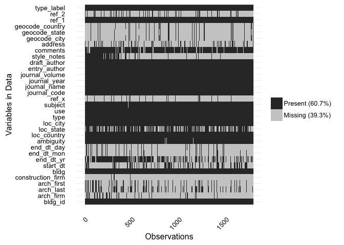
From this “fingerprint”, we can see that some variables are virtually always present, and may be useful to explore first.
bldg(the building name)ambiguityloc_countryloc_citytypeusesubject- The various journal citation fields
Two patterns of note: end_dt_yr and style_notes are more carefully filled out in the early rows of the data, and more sparse in the later ones.
The authors might investigate whether the drop-off in both stylistic description and date information in later records is due to an actual change in published descriptions over time, or whether it is due to a change in the way they entered the data.
Buildling types
Building type is an intriguing part of this dataset. It is always useful to check the distribution of a categorical variable like this.
ga %>%
  count(type, sort = TRUE) %>%
  mutate(
    proportion = n/sum(n),
    cumulative_proportion = cumsum(proportion)) %>%
  kable(digits = 3)
| type | n | proportion | cumulative_proportion |
|---|---|---|---|
| Other (including historical buildings before 1900) | 729 | 0.408 | 0.408 |
| Infrastructure (roads, bridges, railroads, harbors, etc.) | 199 | 0.111 | 0.519 |
| Institutional (private or non-profit) | 187 | 0.105 | 0.624 |
| Cultural establishments government | 166 | 0.093 | 0.717 |
| Urban Planning | 133 | 0.074 | 0.791 |
| Commercial | 80 | 0.045 | 0.836 |
| Residential, single family | 72 | 0.040 | 0.876 |
| Institutional (government, local or municipal) | 54 | 0.030 | 0.907 |
| Institutional (government, state, e.g. Universities) | 48 | 0.027 | 0.933 |
| Cultural establishments private | 26 | 0.015 | 0.948 |
| Government, administrative, municipal | 23 | 0.013 | 0.961 |
| Consumer/commercial manufacturing | 16 | 0.009 | 0.970 |
| Industrial manufacturing | 11 | 0.006 | 0.976 |
| Institutional (government, federal) | 10 | 0.006 | 0.982 |
| Government, administrative | 8 | 0.004 | 0.986 |
| Government, administrative, state | 7 | 0.004 | 0.990 |
| Government, military | 7 | 0.004 | 0.994 |
| Military manufacturing | 6 | 0.003 | 0.997 |
| Residential, apartment | 4 | 0.002 | 0.999 |
| Agriculture | 1 | 0.001 | 1.000 |
Coming up with ontologies for heterogeneous data is a tricky thing.
The number of different building types here (20) compared to the number that have a significant number of constituents (the top 8 categories contain 90% of all buildings; the top, nebulous category “Other” covers 40% of all buildings) gives one pause. On one hand, there is a real distinction to be made between these categories. On the other hand, the importance of that distinction is contextual to the reader.
If one were interested in patterns of institutional vs. residential construction, then one might collapse categories along that functional attribute. If one were interested in patterns of municipal vs. federal construction, however, one might wish to collapse along that jurisdictional (for lack of a better term) attribute instead.
The current, hyper-specific type system in these data might aim to offer granularity. In practice, however, this specificity obscures itself by making opaque the patchwork of shared attributes for each of these types, and thus confounding a researcher who would like to compute across different semantic categories.
The shared terms embedded in the authors’ current ontology of building type suggests that a multivariate ontology might afford more flexibility in constructing analyses.
Rather than a single type, there might be a column for function (e.g. Residential, Institutional, Cultural, Military), one for authority (e.g. Municipal, State, Federal, Private), and so forth.
Deciding how to handle interactions between these attributes would then be up to the individual researcher.1
To be sure, such an ontology would present new challenges. Not every building may have a meaningful value for every column. However, I believe the affordances would outweigh these obstacles. Having now entered a significant amount of data, the authors should consider reinvesting in a more robust ontology for building types that can be spread across multiple categorical variables, rather than concatenated in to one.
In spite of these questions of categorization, we can still explore the building type variable by considering the density distribution of each type. In other words, of all the buildings in the dataset of a given type, where do they fall, proportionally, along the construction timeline?
ga %>%
  ggplot(aes(x = end_dt_yr)) +
  geom_density() +
  facet_wrap(~type_label, ncol = 2, scales = "free_y") +
  xlim(1900, 1930)

“Military manufacturing” construction, for example, was heavily concentrated in 1915, whereas “urban planning” was instead concentrated after 1920. With a more robust ontology, it would be easier to visualize interactions between functional and jurisdictional attributes of these buildings.
Spatial distribution
Curiously, although it is billed as a spatial dataset, the authors have not actually included coordinates in these data. All they have provided are the names of cities, states, and countries where buildings are located.
This is somewhat defensible: coordinates at the city level do not actually give you the street-address location of a building, and so including them might suggest a greater precision than actually exists. That said, the authors are clearly interested in spatial analysis (judging by the preliminary maps shown on the project website), and so it is unclear why they would allow themselves to use coordinates, but not afford that possibility to others. This means that I must geo-code these locations myself, likely introducing a new error as I do not have the historical contextual knowledge about changing place names that the authors are able to bring to this work.
If they have performed significant correction of automatic geocoding, the authors should provide those coordinates, along with some documentation about the process they used to arrive at these coordinates, and what the level of precision is.
For the time being, however, we can add automatically geocode coordinates in order to do some tentative spatial analysis.
# Find unique combinations of city, state, country, and combine together into a
# location string
csc <- ga %>%
  distinct(loc_city, loc_state, loc_country) %>%
  mutate(
    combined = paste(loc_city, loc_state, loc_country, sep = ", "),
    combined = str_replace_all(combined, "NA, ", ""))

# I ran the following lines once in order to create a table of geocodes. They
# are commented out, as I do not want to re-run the code each time I want to
# regenerate this document

# dsk_coded <- ggmap::geocode(csc$combined, source = "dsk")
# save(dsk_coded, file = "dsk_geocodes.rda")

load("dsk_geocodes.rda")

csc <- bind_cols(csc, dsk_coded)

# Join coordinates to buildings
ga <- ga %>%
  inner_join(csc, by = c("loc_city", "loc_state", "loc_country"))
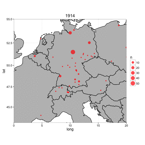
Having joined coordinates to each building, we can plot them on a terrestrial map. Below is a very simple animation of construction (of all types) in Germany between 1914-1924.
map_points <- ga %>%
  filter(between(end_dt_yr, 1914, 1924)) %>%
  count(end_dt_yr, lon, lat)

anim_map <- ggplot() +
  geom_polygon(data = map_data("world"), aes(x = long, y = lat, group = group), fill = "gray", color = "black") +
  geom_point(data = map_points, aes(x = lon, y = lat, size = n, frame = end_dt_yr), alpha = 0.7, color = "red") +
  coord_map(xlim = c(0, 20), ylim = c(43, 55)) +
  theme_bw()

gg_animate_save(anim_map, filename = "anim_map.gif")
There are, to be sure, many different ways to facet this map to include more information, such as filtering or coloring by firm or building type, or by date published in the journal.
However, one question posed by this map is how the geographic focus of German construction shifted over time. Are the construction projects mentioned in the journal concentrated mostly in one area or another in some years? Are there other years where the journal is more diverse?
While it is tempting to try and answer this question solely by looking at images of a map, there are non-visual ways to characterize the relative concentration or dispersion of construction projects year to year. One simple method is to compute the average distance between all the construction sites completed in a given year.
(The following code chunk is quite lengthy - feel free to skip below to the results, though I have also tried to explain what is happening with each function with inline comments.)
library(geosphere)

# Calculate median pairwise euclidean distance on a projected plane
mdist <- function(df, varname) {
  summarize(group_by_(df, varname),
                 disp = median(dist(rbind(plat, plon),
                                    method = "euclidean")))
}

# Calculate median pairwise orthodomic distance on a sphere, independent of
# projection
gdist <- function(df, varname) {
  summarize(group_by_(df, varname),
                 disp = median(distm(cbind(lon, lat)),
                               na.rm = TRUE))
}

# This is an all-in-one function that reshapes our spatial data according to a
# given projection, calculates the mean distance between those points for each
# year (with a 95% bootstrapped CI), and then produces a line plot of that
# changing distance figure. It will also produce a projected worldmap with
# buildling locations and labeled cities for reference
boot_dispersion <- function(bldg, flags = NULL, dist_fun, varname, projection = "azequidistant", ...) {

  prj <- mapproject(x = bldg$lon, y = bldg$lat, projection = projection, ...)
  bldg$plon <- prj$x
  bldg$plat <- prj$y

  dispersion <- bldg %>%
    filter(!is.na(plon), !is.na(subject)) %>%
    filter_(lazyeval::interp(~v >= 1914 & v <= 1924, v = as.name(varname))) %>%
    bootstrap(m = 100) %>%
    do(dist_fun(., varname)) %>%
    group_by_(varname) %>%
    summarize(
      dlow = quantile(disp, 0.025, na.rm = TRUE),
      dmed = quantile(disp, 0.5, na.rm = TRUE),
      dhigh = quantile(disp, 0.975, na.rm = TRUE)) %>%
    ungroup()

  mapplot <- ggplot() +
    geom_path(data = map_data("world"), aes(x = long, y = lat, group = group), color = "black") +
    geom_count(data = bldg, aes(x = lon, y = lat), color = "red", alpha = 0.7) +
    coord_map(projection = projection, ...) +
    theme_minimal()

  # Add city labels if they are provided
  if(!is.null(flags))
    mapplot <- mapplot +
    geom_label_repel(data = flags, aes(x = lon, y = lat, label = name),
                     color = "blue", box.padding = unit(0.1, "lines"))

  distplot <- ggplot(dispersion, aes_string(x = varname)) +
    geom_ribbon(aes(ymin = dlow, ymax = dhigh), alpha  = 0.3) +
    geom_line(aes(y = dmed), color = "red") +
    theme(aspect.ratio = 1)

  return(list(map = mapplot, dist = distplot, distdata = dispersion))
}

cities <- data_frame(
  name = c("Berlin", "Munich", "New York", "Miami"),
  lat = c(52.5200, 48.1351, 40.7128, 25.7617),
  lon = c(13.4050, 11.5820, -74.0059, -80.1918))

# Parameters for map reprojection

# The radius of the projection pedestal (the closer to 0, the more radical the
# distortion)
param <- 0.1
# Pedestal center coordinates and rotation
berlin_orien <- c(52.52, 13.405, 0)
ny_orien <- c(40.7128, -74.0059, 0)
buildyear_disp <- boot_dispersion(ga, varname = "journal_year", dist_fun = gdist)
plot(buildyear_disp$dist)

This first plot is based on the changing median pairwise orthodomic (or great circle) distance of every construction site published between 1914–1924. In more familiar terms, this is the distance “as the crow flies” along the surface of a (near-)spherical earth, and is independent of any particular origin point or map projection.

Visualizing great-circle distance. (Source: Wikimedia)
The gray ribbon indicates the range of a bootstrapepd 95% confidence interval, which means that we are 95% sure that the real median distance of these points lies somewhere within the ribbon. In years where the journal published more samples from which to calculate the mean (like 1919), the CI is narrower, indicating greater certainty. In years with fewer observations (like 1918), the CI is wider.
Even given the relative uncertainty about the exact increase in spatial dispersion, it is clear that the journal’s spatial coverage dramatically spiked in both 1918 and in 1923, where mentioned construction sites were much more widely dispersed across the globe than in other years documented in this dataset.
Alternate spatial perception
It is crucial, however, not to confound the great circle distances being computed here with the perception of space or place by journal authors, readers, or living inhabitants of these built environments. As Saul Steinberg famously captured in his 1976 New Yorker cover, experience of space is subject to far more variables than distance measured “as the crow flies”.

That said, just because we are working with computation does not mean we must hamstring ourselves with just one approach to space.
Although I used great-circle distances for the above calculation, we could instead use a projection dependent on some specified coordinates (such as the aptly-named newyorker projection in R’s mapproject package) in which distances between points close to a specified viewpoint would be larger than distances between points far from the center.
The question: does the spatial spread of the journal data change based on this type of re-projection?
berlin_disp <- boot_dispersion(ga, flags = cities, varname = "journal_year", dist_fun = mdist, projection = "newyorker", parameters = param, orientation = berlin_orien)
multiplot(berlin_disp$map, berlin_disp$dist, cols = 1)
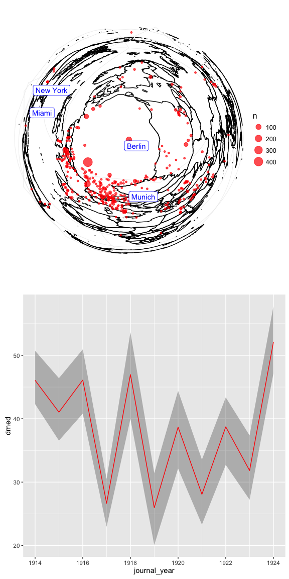
Here we see the globe reprojected from Berlin, where distances close to the city have been dramatically stretched a-la Steinberg, and those far from the city minimized. In this projection of space, year-by-year swings in the spatial coverage of new construction appear much larger. Most notably, from this perspective, the spatial coverage of construction described in the 1924 volume of the journal appears to have dramatically increased, rather than decreased, as it had done in the previous calculation of great-circle distances instead.
By effectively weighting changes close to Berlin more heavily than those farther away, we end up with a very different picture of changing spatial coverage of German construction in this period. This speculative approach could evoke2 the experience of a German reader who might feel the distances between familiar Berlin and Munich more acutely than the distances between foreign New York and Miami.
ny_disp <- boot_dispersion(ga, flags = cities, varname = "journal_year", dist_fun = mdist, projection = "newyorker", parameters = param, orientation = ny_orien)
multiplot(ny_disp$map, ny_disp$dist, cols = 1)
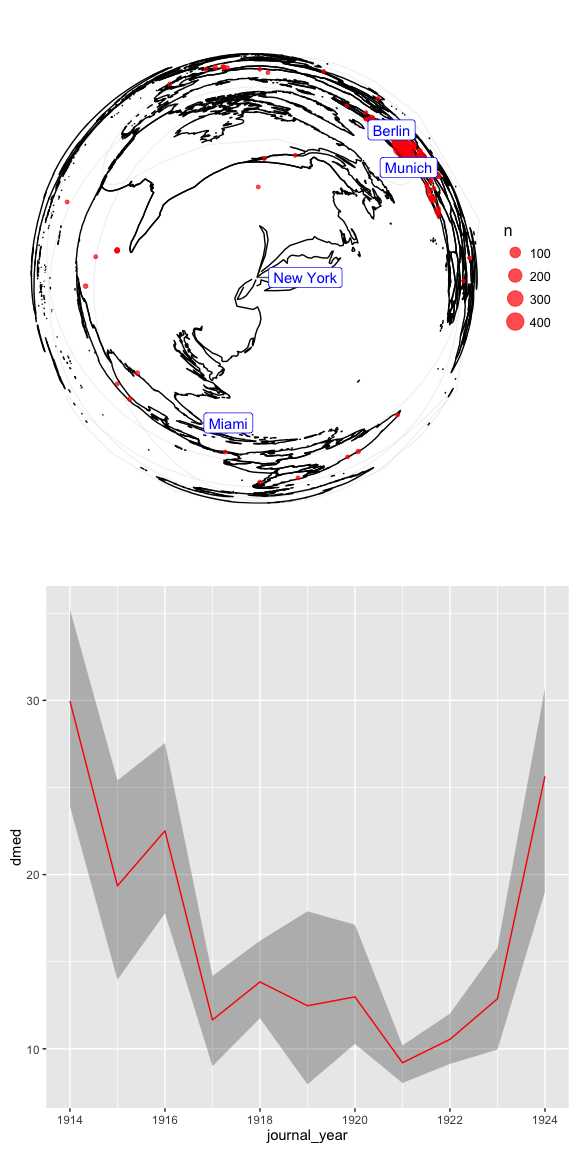
The view from New York City, on the other hand, offers a more gradual impression of what, from North America, could have appeared to be a more steady concentration of construction in the late teens and early 20s - a concentration with a comparative turn towards more international building in 1924.
I wish to stress that neither the great-cirlce distances, nor the Steinberg-esque projections from Berlin or New York, can be said to be any more “correct” than one another.
The former approach embeds the assumption that geographic distance is roughly interchangeable (a 700-mile distance in the United States is equal to a 700-mile distance in Europe), while the latter two views warp these distances based on one’s particular location.
Using the newyorker projection was not intended to strip bias from our spatial analysis, but to instead explicitly reorient that bias in a speculative manner, intended to introduce new questions or nuance into our data interpretation.3
To conclude, in addition to making some adjustments to their data for greater usability, I would also encourage the authors to explore how they might experiment with the subjective qualities of these data. And I hope this explication would not be limited to a narrative aside (“We acknowledge these data are biased, but…”). Rather, they could actively built subjectivity into an analysis that embraces thoughtful speculation and provocation. Creatively computing different perspectives on German construction in this period, whether through spatial re-projection, or some other method, may prove useful for thinking about research problems in architectural history. I believe it could also provide a valuable model of humanistic computational analysis that does not establish data and computing as a deterministic or “objective” method, but instead as yet another humanistic approach that productively transforms its subject of study in order to develop new interpretations.
-
It should also be noted that the current column
usecontains 253 unique values, and so is not currently useful for any type of grouping work. ↩ -
I chose this term deliberately, rather than, for example, “reconstruct” or even “represent”. ↩
-
It is also crucial to note that the underlying mean distance calculation still does not account for the practicalities of actually traveling to a given site. Such an interpretation which would demand a fully-fledged portrait of the period global transport network. (For a project that does this in the ancient Roman world, see the ORBIS project.) Thinking about the spatial extent of German construction in this period may not truly demand that we account for such transit times. It is nonetheless valuable to cycle through subjective computations like these re-projections in order to better clarify for ourselves what types of questions and perspectives we are hoping to bring to bear on these data. ↩
