Best Practices for Using Google Sheets in Your Data Project
A tweet by Hadley Wickham made me realize that we’ve learned quite a few good practices for using Google Sheets as part of our in-progress Provenance Index Remodel project at the Getty Research Institute.
Can you point me to any good papers or blog posts that document best practices for using google sheets when collecting data?
— Hadley Wickham (@hadleywickham) March 26, 2018
This post is an attempt to sum up some lessons learned.
A quick bit of context: while you can read more about the PIR project on the Getty website, from a technical standpoint what we’re doing is a very involved research database migration and enhancement project out of a legacy storage system into a modern graph database. This is not a “pure” database migration that can be accomplished by a passel of well-written scripts. We needed to do a huge amount of data cleaning and enhancement that involves new research work by subject specialists with years of experience working with archival source documents. As the resident data scientist and art historian at the Getty, I work in close collaboration with our software engineers and our subject specialists to figure out what new research is needed to accomplish this migration, and how to build those tasks as seamlessly as possible into our workflow.
Our tech stack includes an R-driven incremental build system for reshaping these enhanced data exports, some clever graph mathematics, a bit of machine learning, even a dusting of neural networks for the natural language processing that we need to do as part of our research.
But none of it would work at all without Google Sheets.
Why? Much of this new data entry and editing involves computing views of the data not supported by the current production system. The new data entry tasks we’ve identified are almost all one-off tasks that won’t need to be repeated after this project, and were also so disparate and unpredictable that we quickly realized it was not worth our time to write a “real” CRUD app from scratch. So early on, we decided to use Google Sheets as a system for hosting worksheets that our staff could collaboratively edit, and that I could (almost) painlessly incorporate into our ETL pipeline.
While some of the tips below may seem like common sense, I hope it’ll be helpful to others working on similar projects.
I’ll start off with our one unifying lesson:
80% of sheet design should be for editors, only 20% for data scientists
There are two audiences for these sheets: the editors who are consulting and modifying them, and the data scientist who is consuming them. A common theme of the best practices we arrived at is that these sheets need to be designed primarily with the editor user experience in mind, with the data scientist’s user experience an important, but only secondary consideration. You’ll see what I mean with my first tip:
Don’t make the sheet too Tidy™️
As an R user well-versed in the Tidyverse, I have a pathological need to produce tables of Tidy data with one variable per column, one observation per row, and one table per “observational unit”. While this form is ideal for running tabular operations like filtering, grouping, and aggregation, it makes life a bit difficult for data entry. By making our Google sheets slightly un-Tidy, we vastly increased quality of life for our editors while only slightly increasing the work that I needed to do.
For example, one of our key tasks is reconciling dozens of free text fields to the Getty’s Art & Architecture Thesaurus, a controlled vocabulary of cultural heritage concepts. Any given set of plain text terms about, say, artwork materials, has a one to many relationship with AAT concepts. It might take anywhere from two to a dozen different terms to represent this free text via AAT. In a “Tidy” table, this would mean repeating the original plain text terms over multiple rows, pairing them with one AAT concept and one property type (e.g. materials, support type, object type, technique) per row.
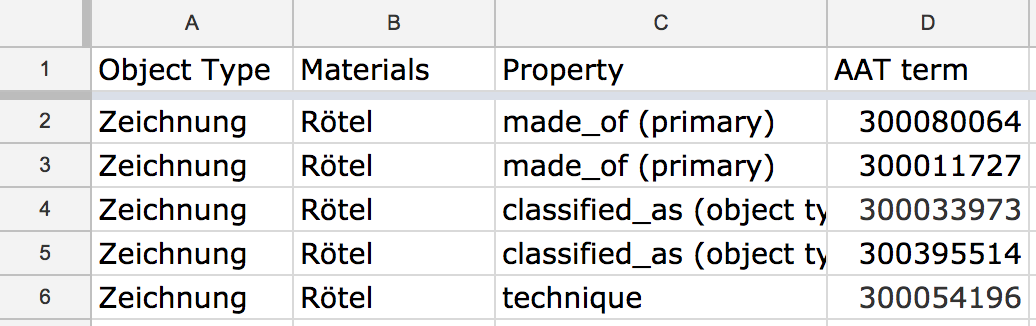
A ‘long’ Google Sheet.
This format makes it a breeze to programmatically join those terms back onto artwork records. But it sucks for data entry.
No user should have to waste time duplicating rows and constantly reminding themselves which property names they need to target in order to fill out this sheet. By eliminating all empty cells, a “long” format also makes it much harder for an editor to visually assess how complete the reconciliation of some set of free text terms has been.
On the other hand, a “wide” data format allows our editors to quickly tab through several columns, putting multiple AAT terms into one cell when needed (e.g. a painting made on canvas mounted on panel would need two AAT terms to describe its “support”) by separating them with a semicolon.
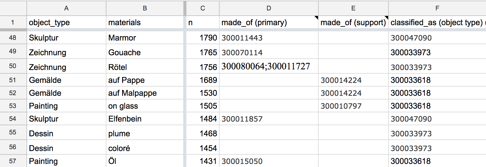
A ‘wide’ Google Sheet.
Denormalizing these worksheets meant we could also add in additional contextual information in adjacent columns. While that added data might be redundant for my purposes, it meant that editors had all the info they needed to do as much of the task as possible within the Google sheet interface, without needing to open another tab to consult the production database when they needed additional information to make a decision.
This format does mean a little extra engineering on the data processing end.
Multiple values needed to be split out, and tidyr::gather()-ed into a long format suitable for easy filtering and joining.
However, I only needed to code that data reshaping once, while our editors had to bravely reconcile hundreds of different free text combinations.
This tradeoff was a no-brainer.
Use data validation and data protection
Sheets were a compelling UI solution because our editors were already well-versed in working with Excel spreadsheets, and so recognized the form.
However, sheets’ easy edit-ability was both a blessing as well as a curse: it’s easy for a user to accidentally change data they shouldn’t, or to enter data that doesn’t adhere to the desired schema.
Although Google Sheets can’t offer the bulletproof data correctness guarantees that a relational database with well-designed data types and constraints can, its tools are good enough to catch a lot of mistakes.
By using the Data > Protected Sheets and Ranges... tool, I could restrict columns that came from the source data, and which I needed to stay untouched in order to do proper joining later on in the pipeline.
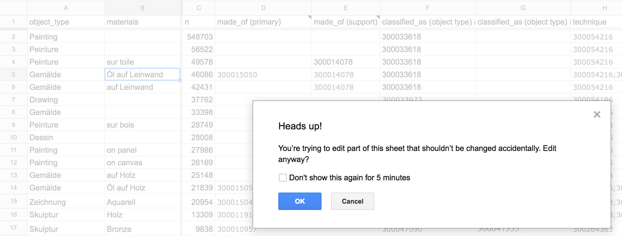
Protecting certain columns meant editors would get a warning if they accidentally modified cells they shouldn’t have.
When we knew that work was complete on a sheet, we could protect the entire sheet against further modification, turning it into a read-only data source.
Data > Data validation... also offered a surprisingly large array of tools for checking the contents of what editors had entered: from simply requiring that a value be entered into a field, to specifying a dropdown menu of possible values, to running an arbitrary function.
In our case, we just ran a regular expression to check that the entered number was 9 digits.
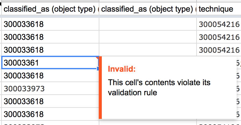
Running a regex over entered data could catch typos.
Don’t use formatting to carry data, but DO use formatting to help your editors
It’s commonly accepted that you should not use formatting like color or font faces to store information in a spreadsheet, because it doesn’t survive the conversion into a CSV or a data frame. This isn’t wrong; from my perspective as the data scientist, formatting was useless for our data transformation code.
However, it was anything but useless for our editors. A spreadsheet is just like any graphical user interface. Spatial, color, and other formatting cues are vital tools for facilitating user comprehension. In another data enhancement problem, we needed to link together disparate records that were actually talking about the same object. While a lot of this work could be automated through careful parsing of editorial notes, we still have a few thousand ambiguous cases where I couldn’t match records through scripting alone. In some cases, we knew a record had a match somewhere in the system, but I couldn’t find any candidates; in other cases, I turned up way too many candidates. Both cases needed a human to solve them.
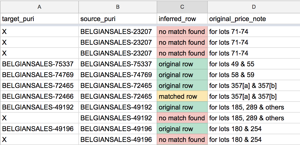
Adding conditional colors based on data content helps make a spreadsheet much more readable.
By using the Data > Conditional Formatting... tool, I could add some color cues so our editors knew which situation they were facing for a given record.
This let us put these related tasks into the same table, reducing cognitive load for everyone involved.
Even for comparatively simple data entry tasks where we are just flipping true/false flags, adding a little conditional formatting made it much easier to visually scan through a table to get a sense of how work was progressing. Breaking up the monotony of black text on a white grid goes a long way in making a repetitive task more bearable.
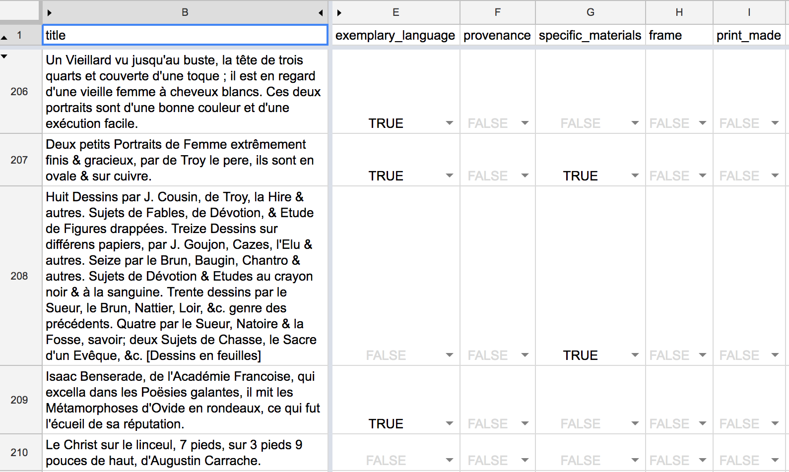
Auto-formatting editor-entered data makes it a lot easier to scan a table that is otherwise visually repetitive.
By using formatting to better communicate and highlight data content, but not use it as a replacement for data content, we could maintain good data practices while also giving our editors a better user experience.
Have a feedback mechanism in place
Ultimately, Google sheets have been crucial to our project workflow because it is very easy to iterate their design.
We learned early on that the first draft of a worksheet schema that I produced wouldn’t be the last.
Editors might come back asking me to join on some additional columns for more contextual info, or they may suggest that data entry needs to happen over several columns rather than in just one.
Since Google sheets have persistent URLs, it was easy to begin coding up the pipeline infrastructure for reading the sheet using the googlesheets package while editors began testing.
If and when we needed to modify the schema, I could just update the sheet in place, and tweak my reshaping code where needed without having to hardcode new URLs into my scripts.
Naming individual worksheets and explicitly calling those names when running googlesheets::gs_read() also helps prevent breakage when adding new tabs to a Google sheet.
Conclusion: happy editors == happy data scientists
These sheets aren’t a hardened production system for long-term data entry and storage. And I will be happy to leave them behind once our new production system is up and running.
However, they are the right tool for the ad hoc jobs that we need to run right now as we prepare to finally migrate these data into a “real” database. By combining easy iteration with just the right amount of data validation and formatting tools, and using a flexible approach to data reshaping that favors the editor workflow first and the data science workflow second, we got 90% of the user interface we needed with only 10% of the work of building one from scratch.
Update: 2018-06-11
I’m delighted to see this post featured in two great data science resources:
