Looking through the ULAN with Gephi, III
In my last two posts on using Gephi to read the Getty Union List of Artist Names, I have been straightforwardly visualizing the relationships explicitly described by the dataset. This approach was a natural first step. The ULAN’s structure is artist-centric; creating a list of nodes meant reading the list from top to bottom, creating a list of edges was essentially the same task.
However it was the ULAN’s geographic information that had initially interested me. Could we usefully combine a geographic visualization with a social network visualization?
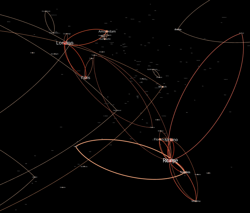
I rewrote my Ruby scripts to create a node list from the many geographic locations mentioned in the database, and to create an edge between cities where a relationship is described between artists inhabiting those locations.
This meant reading against the grain of the ULAN. Its hierarchy is artist-, not location-centric. While each artist entry in the ULAN has all the info you need to define an edge to another artist, this is not true when defining edges between locations. Instead of reading through the ULAN from start to end, the computer would have to skip around the data out of order, climbing up and down the XML hierarchy to find names and addresses of its artists every time it defined a new edge between nodes. To ease this process, I asked Ruby to re-copy the ULAN into a new, slimmed-down format (a series of nested hashes) that the computer could query much, much faster than slogging through the original XML file.
The resulting graph looks a bit sparse. Like my earlier graphs, this is the result of using only a tiny subset of the full ULAN. It also only represents connections between two artists who each have full geographic location, which filters out many of the entries from this subset of the database. But it offers some exciting prospects for a full-fledged geo-graph of the ULAN. Because every artist comes with life dates, we can associate every edge in the graph with a time range, which lets us easily filter our view of the graph. With some more refining, it would be possible to animate the evolving continental (or global) links between artists over the centuries, fleshing out, or even problematizing, our current narratives of artistic communication.
However I felt not a small amount of pride after putting this all together. The initial graphs are exciting and useful, but they are very literal visualizations of the ULAN - i.e., low-hanging fruit. Reading geographically, on the other hand, pushes against the structure of the original dataset. It is a testament to the folks at the Getty that the ULAN is so consistently structured that it is possible to extract a visualization like this, even when it does not follow the dominant grain of its source database.
