Tidy Data for Humanists: The Remote Version
Last year, the University of Pennsylvania’s DREAM Lab was cancelled due to the pandemic, and instead of trying to rapidly revise our courses to go remote, we put out some of our course materials and a podcast.
This year, we committed to a fully-remote DREAM Lab, and you can see the course website and materials here: https://matthewlincoln.net/tidy_humanities_data
What worked well
-
Looking at real-world spreadsheets together. We hear a common refrain from folks trying to get started in DH projects: “it would help so much if I could just see someone else’s spreadsheets.” I was nervous that sitting down and walking people through a few data tables would be dead boring, or would better be done as a pre-recorded video. However, being able to talk through key principles of tidy spreadsheet design synchronously turned out to be crucial. Students had so many questions during these sessions, and the ability to live-edit the sheets to demonstrate different strategies was invaluable.
-
Using Miro as a virtual collaborative whiteboard service. One of the things I was most worried about was the students not being able to work through problems with pen and paper, or diagramming on poster boards, erasing, and diagramming again as they iterated through different solutions to representing their various historical and cultural sources as data.
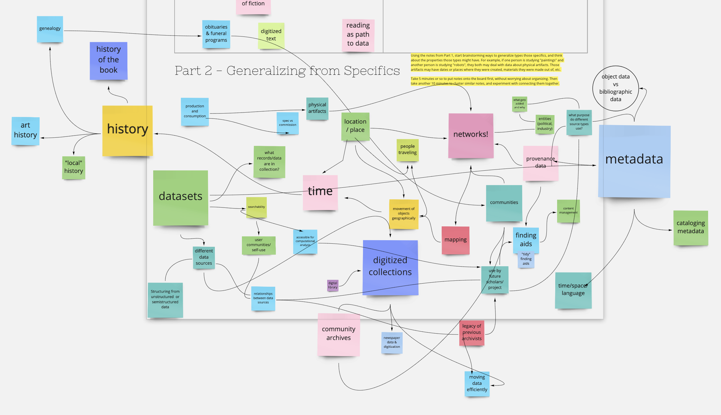
It turns out Miro may have offered an even better experience than physical paper, as each breakout group could readily see what others were doing, and it encouraged all members of a group to work at adding notes and annotations, rather than designating a scribe as often happens in these kinds of exercises. We used the boards in a wide variety of ways - from icebreaker exercises where the students got to know each other and find commonalities with the data problems they each experienced, to posting notes, questions, and references during our reading discussions, to collaboratively building entity-relational diagrams.
One important downside of Miro - even with just a dozen or so users working at once, the visual activity on a board can become overwhelming. Next time, I’ll want to think carefully about how to keep the boards as simple as possible, and to show students how to hide the motion of their classmates’ cursors on their own screens.
-
Having a brilliant teaching assistant who knows the ropes. I had the distinct honor of working with S.E. Hackney, a PhD candidate (and soon-to-be full PhD!) in information science at the University of Pittsburgh. They had taught at similar workshops before, and gave an excellent talk to close out the class, demonstrating how the data tidying skills we had learned were crucial to their own research.
-
One-on-one data consults. We offered slots for individual students to talk with instructors one-on-one about their particular projects, and unsurprisingly these turned out to be quite popular! I’m not sure how I’d make it work with a larger class, other than to have yet more teaching assistants who were also well versed in doing these kinds of consultations.
What I’ll do differently next time
-
Don’t shy away from direct instruction. My ideal structure for the class was lots of practical data tidying exercises interleaved with discussion of critical readings about humanities data. I really wanted to minimize zoom fatigue and reduce the amount of time I spent talking at students on camera. However, it turns out the few portions of the class that I set aside from “brain dumps” of good practices about dealing with data types and common data problems and mistakes were some of the most productive and engaging.
By walking through these lists of best practices while looking together at a real set of humanities data, we anchored the abstract concepts to a concrete example. I was also pleasantly surprised at the number of questions that came up during these sessions as well - what I feared would be non-interactive and boring was apparently quite engaging.
-
Settle on a single example dataset to use across all the instruction modules. I ended up using 3 different exapmle datasets during course, and in retrospect I realize that I started them out with one of the most complex ones first, in an effort to show them the kinds of data visualization they could do with well-tidied data - a motivator for the rest of the course.
While I still like the idea of “starting at the end” by showing off data visualization with tidied data, I’d want to scaffold it better, and then make sure for the following units on good data practices that we use a consistent dataset that becomes familiar to the class over the short time we’re together.
-
Make data documentation, publishing, and sustainability its own module! I had budgeted flex time for the final afternoon of the class, knowing that there were many things we wouldn’t be able to cover, and rightly assuming that by the penultimate day we could decide as a class what warranted more discussion. The decision was almost unanimous: how do we document our data? This wasn’t a shock, and we had plenty of resources and material to pull together a session, but in the future I’d add it as a core part of the workshop.
-
Find better ways to pitch the class. “Data visualization” might be sexy, but “data tidying” isn’t - even though any practitioner worth their salt will tell you that it’s 90% of any kind of data analysis project. I was more than happy with our class attendance of ~16, but we did have a bit of melt between the number of students who had confirmed their interest in the class, and the number who really showed up on the week of.
As Dream Lab organizer Stewart Varner said during our closing meeting, “data tidying is a class that everyone needs to take but they probably don’t realize it yet.” To attract all those folks who don’t yet know they need to take the course, maybe I really need to call it “Excel for Humanists” like Dr. Heather Froehlich does! (Heather, if you’re reading, I still say we need to do a collab course…)
